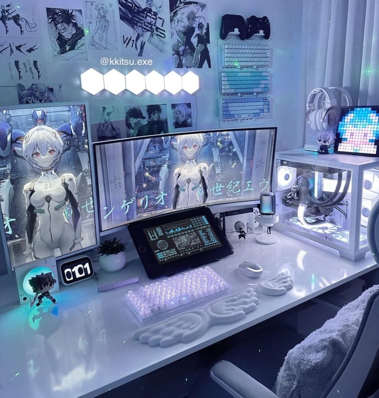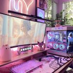

Which lighting do you prefer in my setup hexagonal or triangular? The hexagonal lights went viral on my Instagram tho


Which lighting do you prefer in my setup hexagonal or triangular? The hexagonal lights went viral on my Instagram tho
You must be logged in to post a comment.

the lighting is 🤩🤩 i prefer hexagon
I like the softer lighting of the 2nd more. The first feels a little more harsh
Ehh I like the triangles. But both look cool
I like the first! I feel like it provides a nice, soft contrast to all of the hard lines on your setup (like case, monitors, wall art, etc) and kind of ties into the soft lines of the wrist pads and creates a nice balance. I would bet your setup went viral because it’s just an awesome setup in general though, so choose whichever you like the best!
(Idk why I’m using all this artsy lingo I guess I’ve been watching too many home design shows but first one still for me!)
The first oneeeee. The rei/theme is gorgeous.
Everyone has the triangles so the hexagons are a bit more interesting imo
First one looks amazing
I swear I thought this was ai for a second, it looks so futuristic
I prefer the lighting on the second and I think the desktop wallpaper and other design of the desk is carrying the first picture more than the lights.
triangular look cleaner imo
Wow kosmos. Wouldn’t think anyone remembered her
hexa
Definitely the first one (yeah won’t lie I’m biased because of Rei).
I like the hex myself.
1st one. Looks so good btw
Hex and holt shit that is beautiful